Wikipedia Redesign

Wikipedia is the largest and most used encyclopedia in the world, but has not undergone any major design upgrade since its creation over 10 years ago.

Project Overview

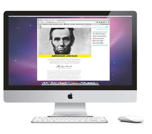
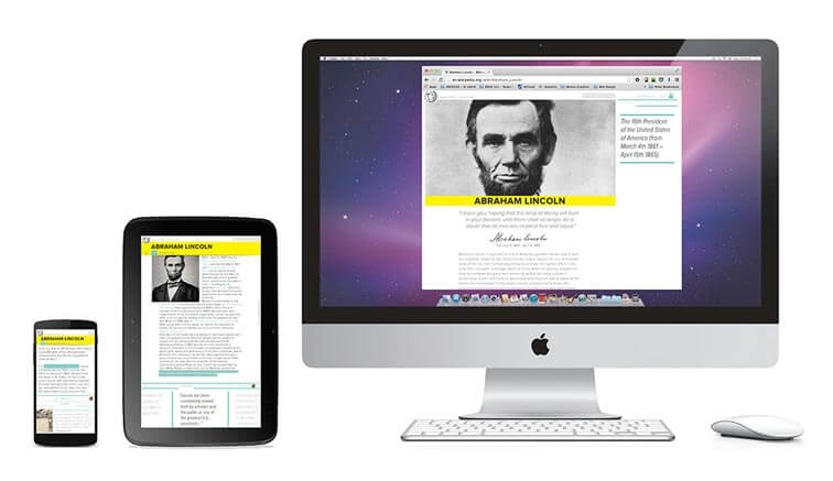
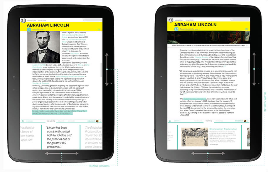
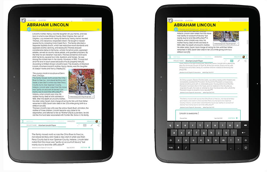
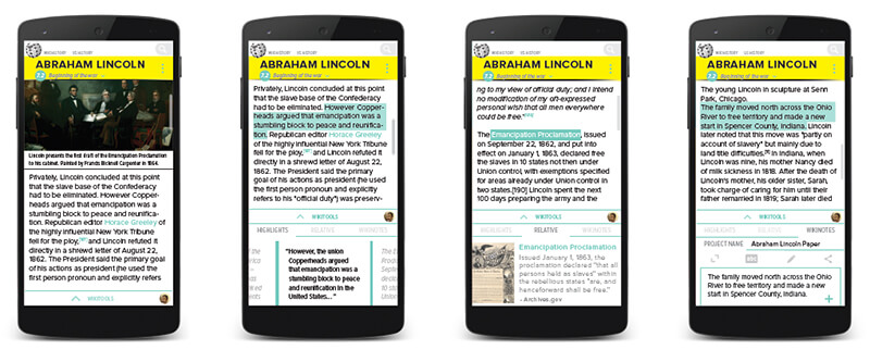
The Wikipedia redesign project is an exploration in responsive web design, where the same UI kit is applied and adapted to the same site over different platforms. The Wikipedia website was chosen for this project, and redesigned for desktop, tablet and mobile platforms. Research based design decisions were made to improve the user experience, taking the behaviors and needs of visitors into consideration.

Wikipedia is a site that while wildly popular, has not undergone any major design upgrade since its creation over ten years ago. The redesign has to stay true to the orginal purpose of Wikipedia, an encyclopedia that allows every single human being to freely share in the sum of all knowledge, while attempting to improve upon the user experience.

industry

Mobile & Web,
Encyclopedia

skill sets

UI & UX Design,
Motion Graphics,
Design Research

User Behavior

Wikipedia has a user base of 460 million users every month. While much of the world is going towards mobile, 70% of Wikipedia’s users will access the site through a PC, leading us to focus the redesign as ‘desktop first’ while improving the experience for mobile and tablet users as well.

It is also important to keep in mind that many people use Wikipedia as a starting point for research and information reference, creating opportunities to improve the user experience.

A New User Experience

The first design issue addressed was giving the site more personality, opening every page with a large photo of the topic, accompanied by a brief introduction. This allows the user a quick overview before proceeding into the often long and indepth content, creating more interest by making the topic easy and approachable to begin with.

Parallax effects are used to hide the large intro image and reveal an always accessible interactive contents menu. Users can hover over content chapters to reveal relevant imagery. By using Wikipedia's rich universe of available imagery to its full potential, we create an experience that is more interactive and visually engaging for the user.

Improving Legibility

Studies in web usability have found that people do not read when on the web, but instead scroll and scan through articles quickly. Wikipedia articles are often long in length, highlights of significant content from the article text on the sidebar can aid users as they scroll down the article page, helping them to chose when to stop and read in more detail.

One key issues with wikipedia is there is no limitation of the width of the article content lines, resulting in very wide paragraphs, which are typographically difficult to read. By setting a limitation on the paragraph width, we improve legibility for readers, while freeing up sidebar space for increase functionality, such as article content highlights.

Improving Accesibility

Wikipedia already does a great job of connecting relative articles using hyperlinks within article text. However, this method does not effectively match the user behavior of scanning and scrolling through web content. The relative option for the sidebar visualizes these hyperlinks to help users notice relative topics more easily.

The sidebar contents scroll with the scrolling of the page. For the sidebar relative option, we create an experience that is more visually engaging, encouraging the user to be more attentive even when scrolling through an article. The different sidebar options also allow the user control over how they can use wikipedia most effectively.

Improving Functionality

Another side space feature is Wikinotes, allowing users to easily record notes on the topic of the article they are viewing. Wikipedia user studies have found that 70% of Wikipedia users are college degree holders and use Wikipedia as a starting point for research.

Notes are collected by highlighting article text with the Wikinotes function selected. Citations for collected notes are automatically added for reference. Users can log in to personal accounts where notes are collected, stored and catagorized according to project title, available for access anytime. By recognizing the main purpose why people use Wikipedia, the Wikinotes function enhances and adds value to the user experience.

Tablet & Mobile


As users continue to increasingly use portable devices, it is important to make both desktop and mobile experiences compatible and consistant. To adjust for the decreased screen-width, the sidebar has been transferred to the bottom of the page, while the contents page is still always accessible from the top of the page like the desktop version.

The Wikitools bar has been minimized by default, but can be tapped open to access it features. Due to less available screen-width, the content of the page is prioritized to enhance the reading experience. By giving users the option of when to see the wikitools, they can choose when to use its features and control the user experience to best meet their needs.

Wikitools - Text Highlights & Relative Links

Above we have tablets with the Wikitools expanded from the bottom of the page, showing the text highlights and the relative links. The content in the wikitools bar will scroll horizontally relative to the user scrolling up and down the page.

Wikitools - WikiNotes

The Wikinotes feature works the same way as the desktop version, where the highlighted content will be saved when the tool is selected. Users can adjust the height of the window to accomodate a keyboard for input of personal notes.

The mobile version is very similar to the tablet version, with the wikitools minimized at the bottom of the screen, giving users the option of when they want to access it. Text highlights and relative links move horizontally relative to vertical movement of the content. Wikinotes works by highlighting and can shift higher to allow keyboard access.

Research