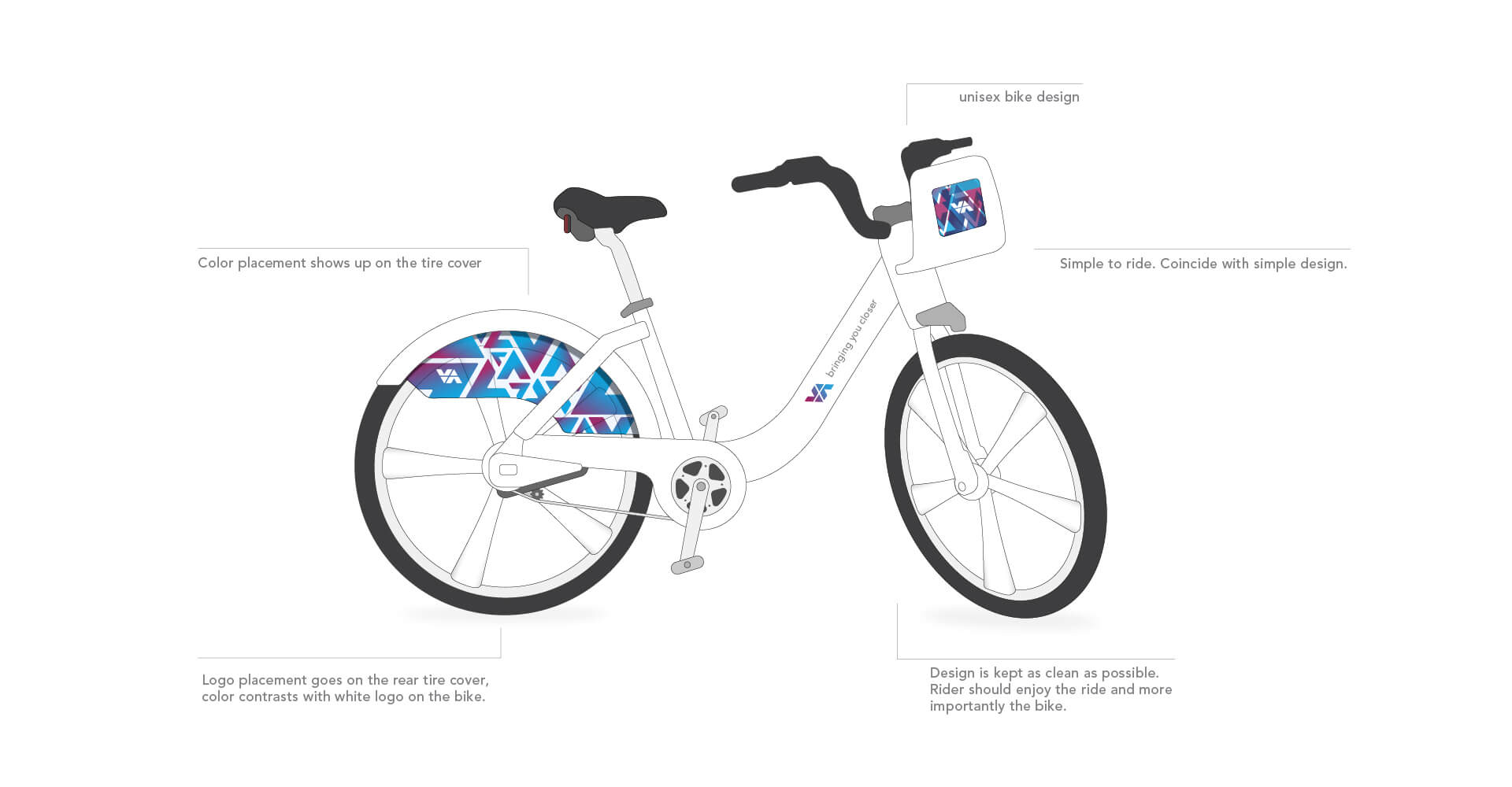
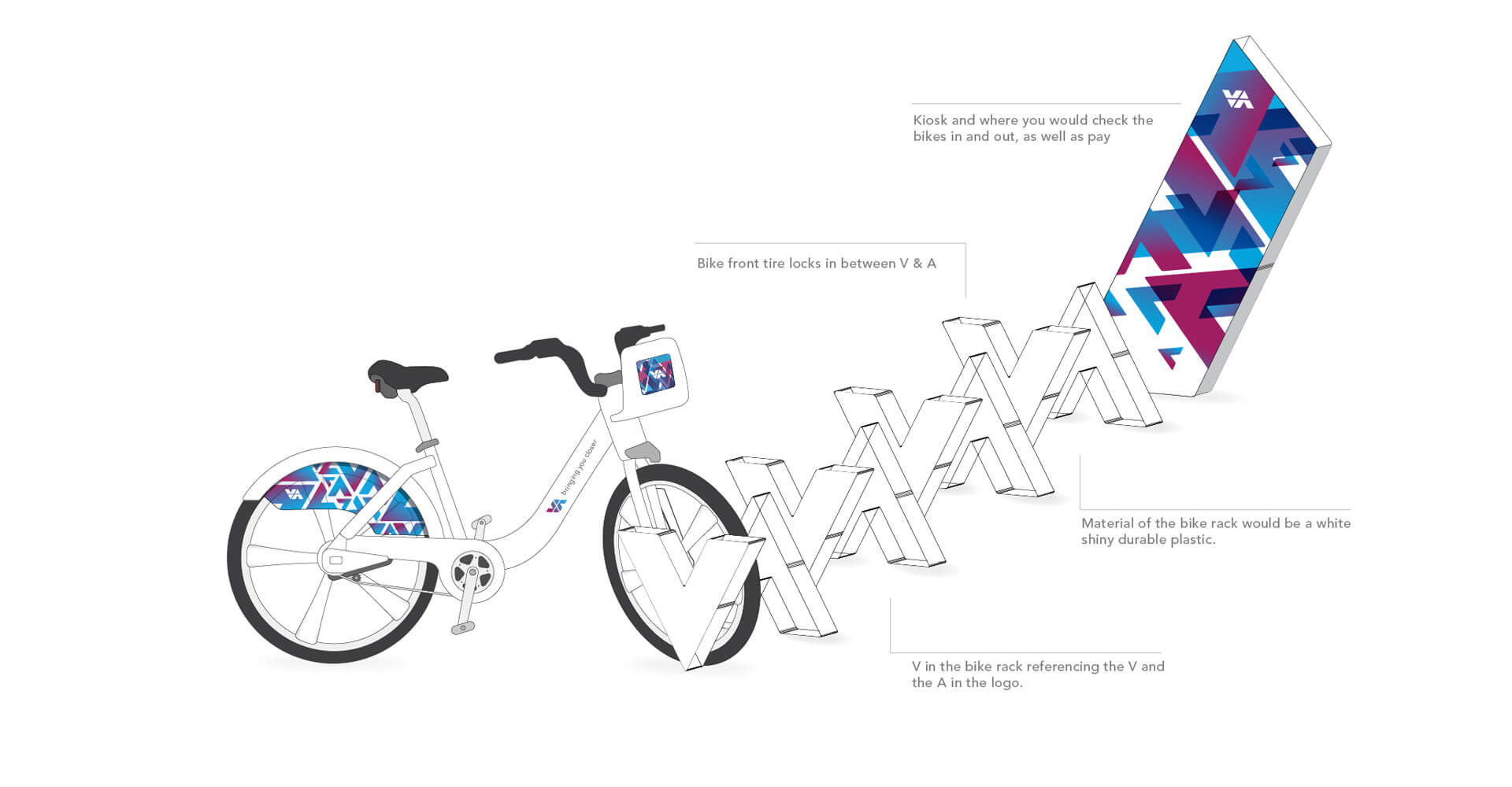
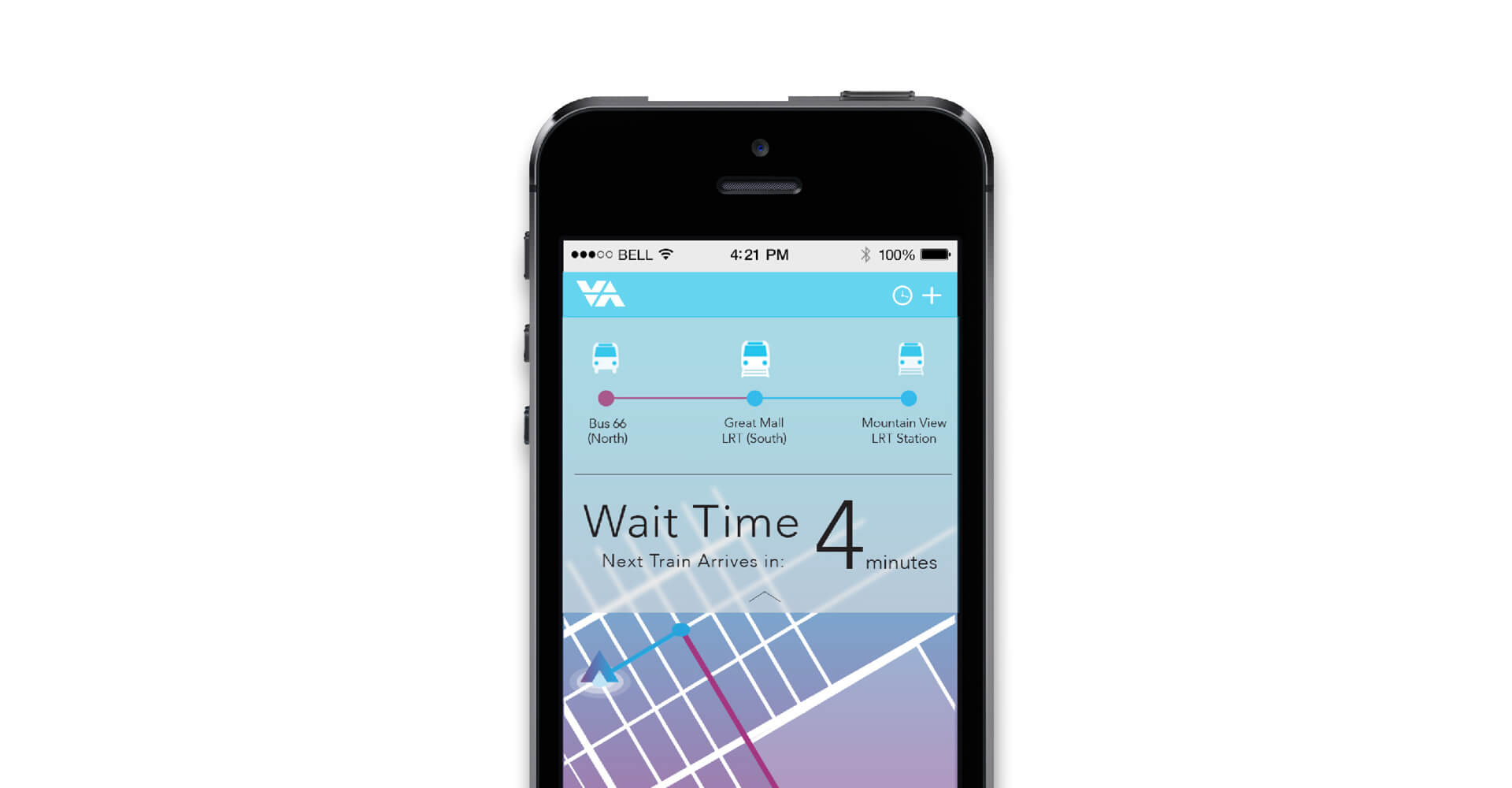
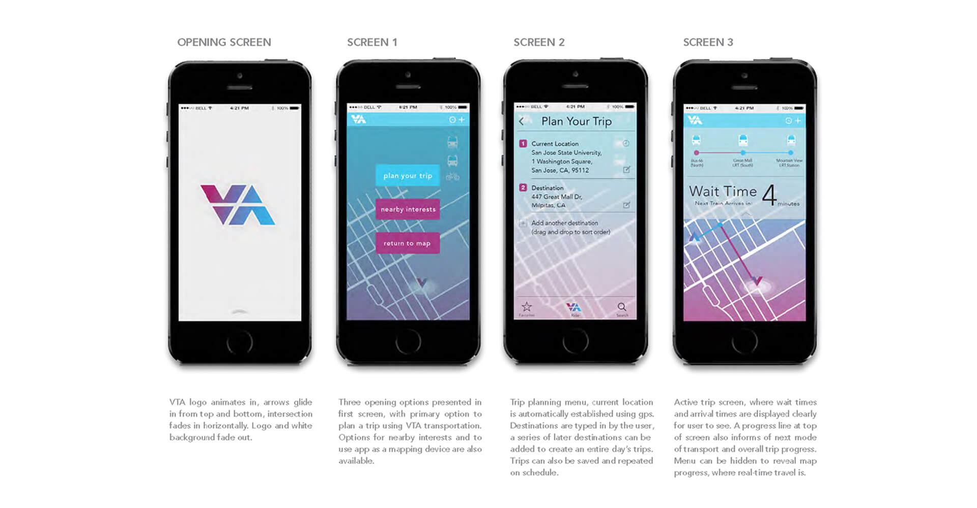
VTA Rebrand

The Valley Transportation Authority is a public mass transit provider for the Santa Clara county region in Northern California

project overview

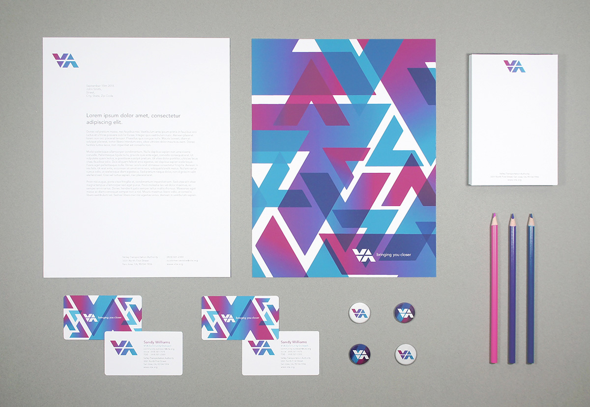
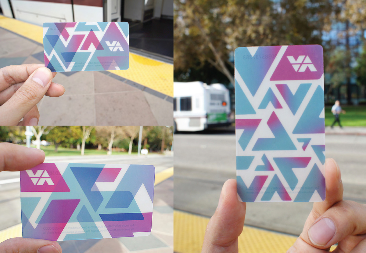
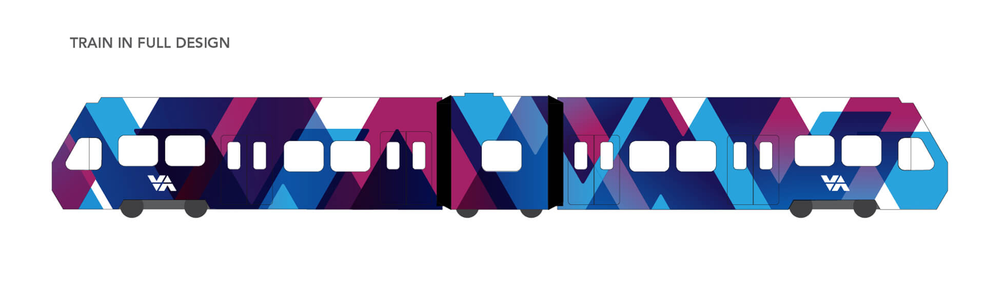
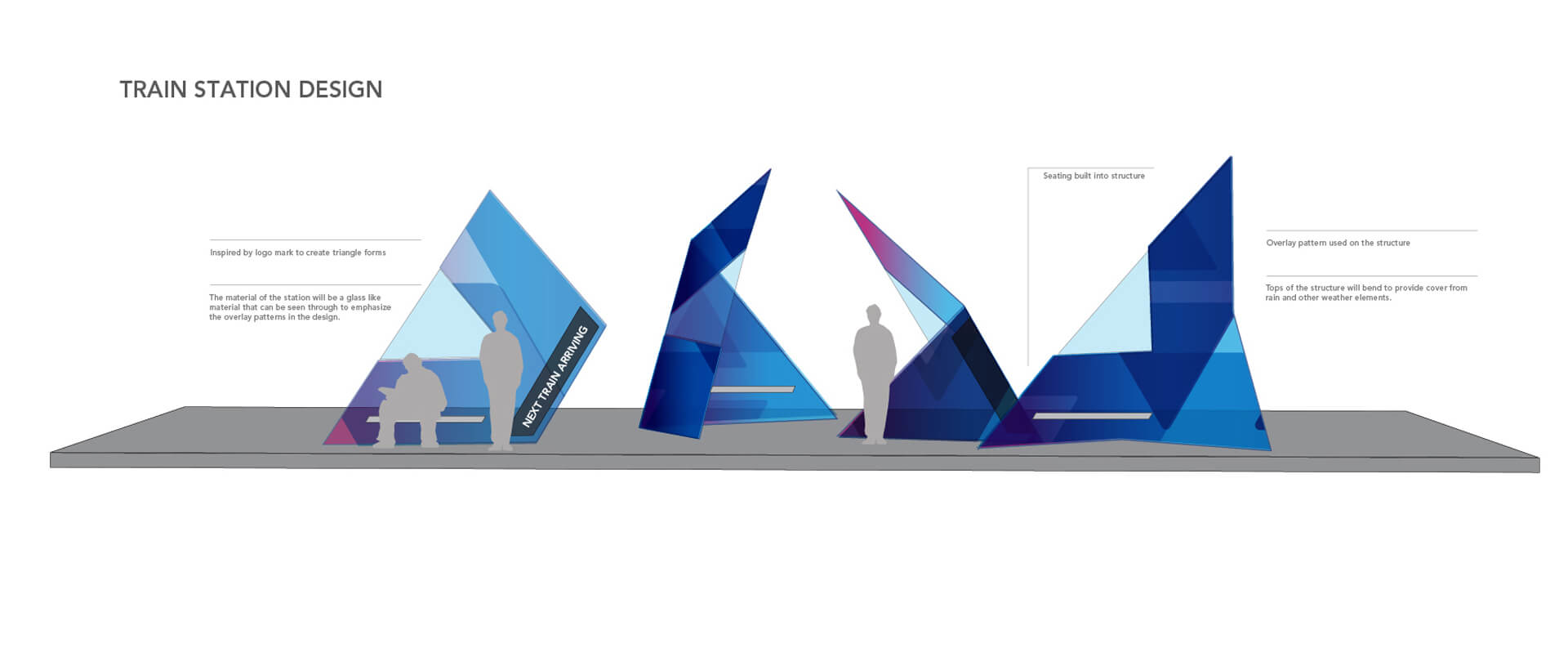
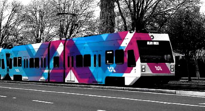
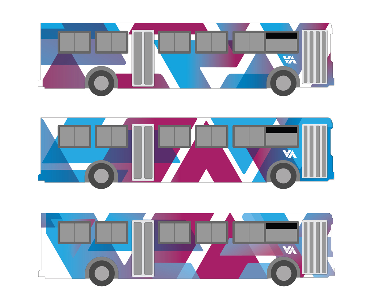
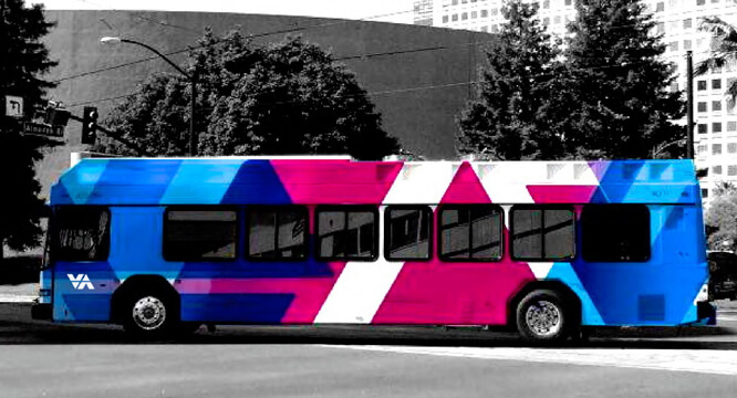
The function of public transportation has always been about more than moving people from one place to another. It acts as a lifeline to the entire community, and becomes a common thread between individuals in the area. We made it our objective in re-branding the VTA to make an identity that is representative of the movement and energy we know the people of Santa Clara county possess and create a new way to bring people together.

This branding system was a team project for the 3D Branding class at San Jose State University with supervision from Professor Joe Miller. The project was exhibited in Works Gallery San Jose, and featured in SF Design week 2014.

industry

Public Transport,
Bus and Light Rail

skill sets

Branding, Identity,
Visual Design

Design Team

Kayla Carlot,
Maya Ealey, Cindy Fu,
Michael Mirchandani

logo


stationary


fare card


light rail


bus system


bike system


mobile + web


uniform


process


The VTA rebrand is based on the idea of movement, using the characters V and A to represent two arrows moving in opposite directions. Patterns were created to express ideas of movement, balance and harmony, expanding the visual vocabulary of the brand. The selection of a gradient of colors from blue to purple match the colors of the sky at sunrise and sunset, communicating a sense of efficiency and reliability, while also providing a dynamic and trustworthy energy you can feel. Typography uses the friendly and modern sans-serif Avenir typeface, making the brand feel efficient and approachable at the same time.

Patterns Slideshow (7 images)

Logo Element Construction

Color Palette

Typography