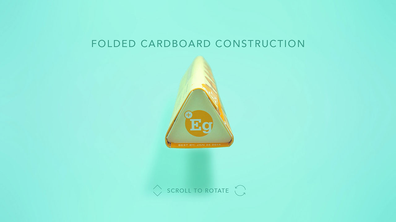
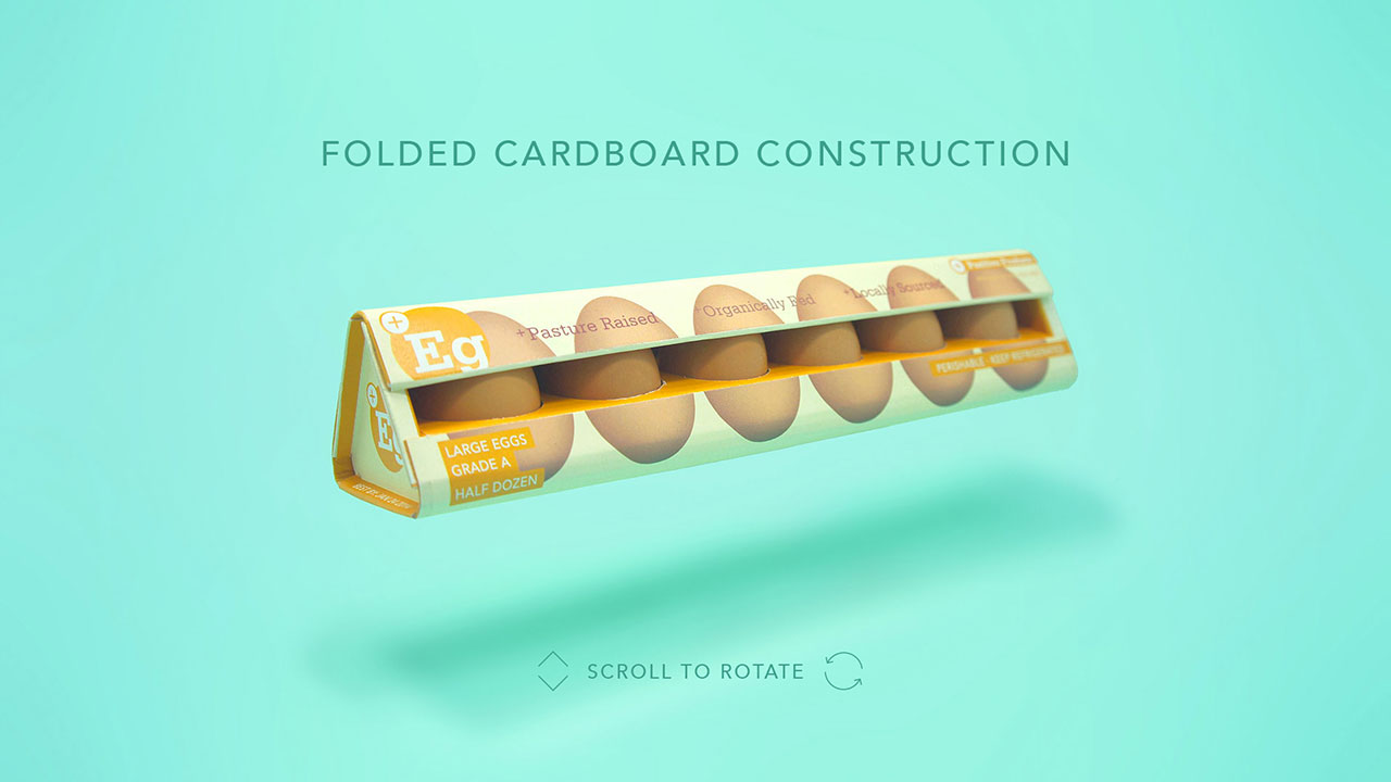
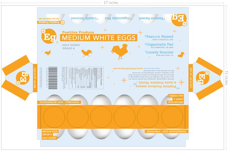
Positive Produce

Positive Produce is a brand that represents a simpler way of creating food that is natural, healthy and positive for the world. Positive Eggs are just one of their products.

project overview

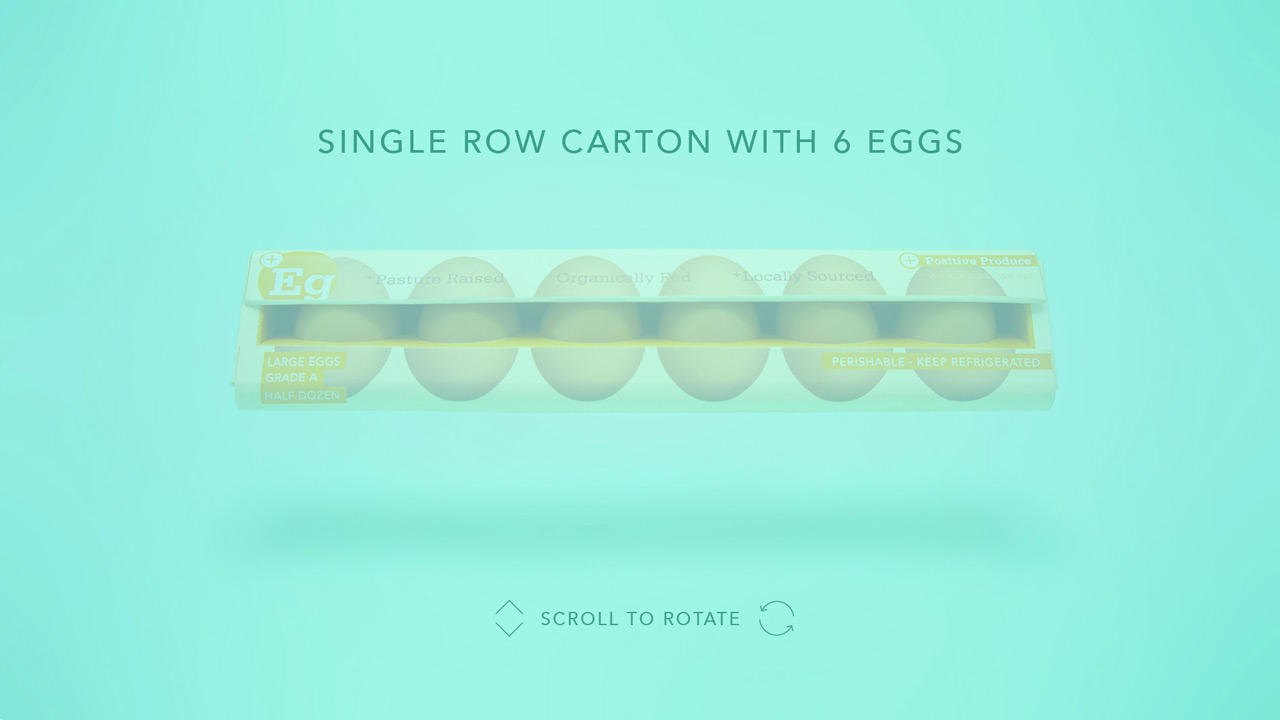
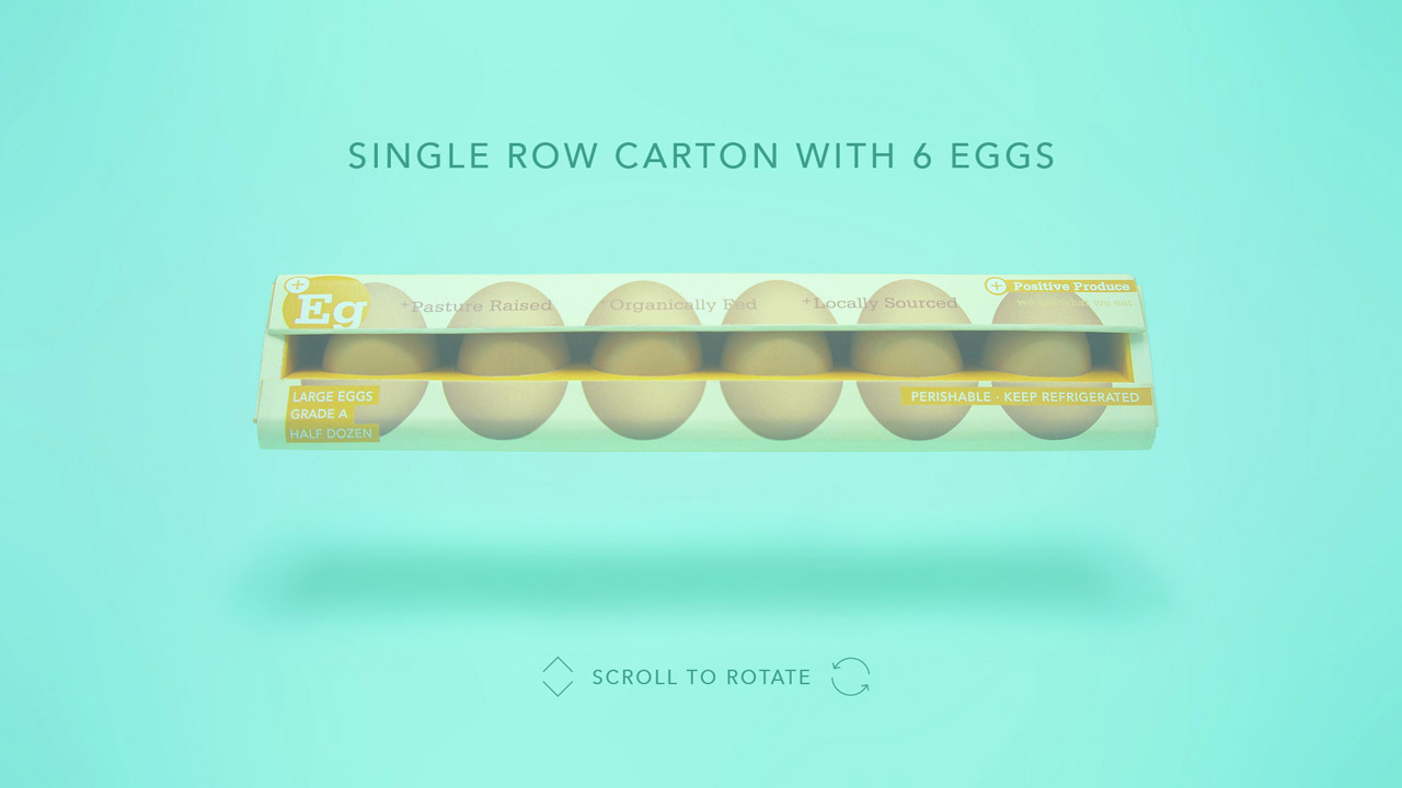
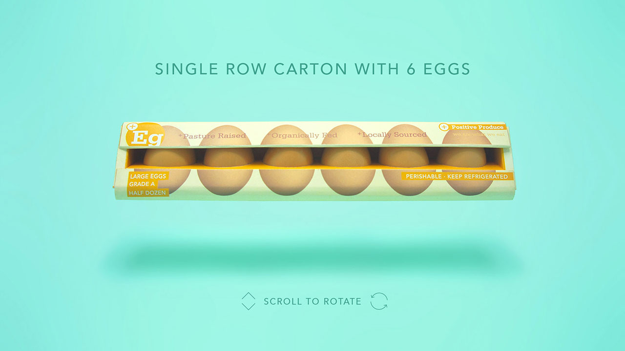
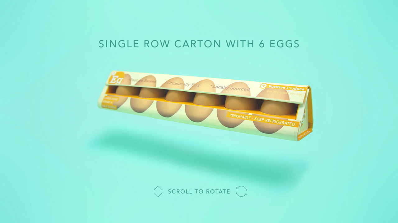
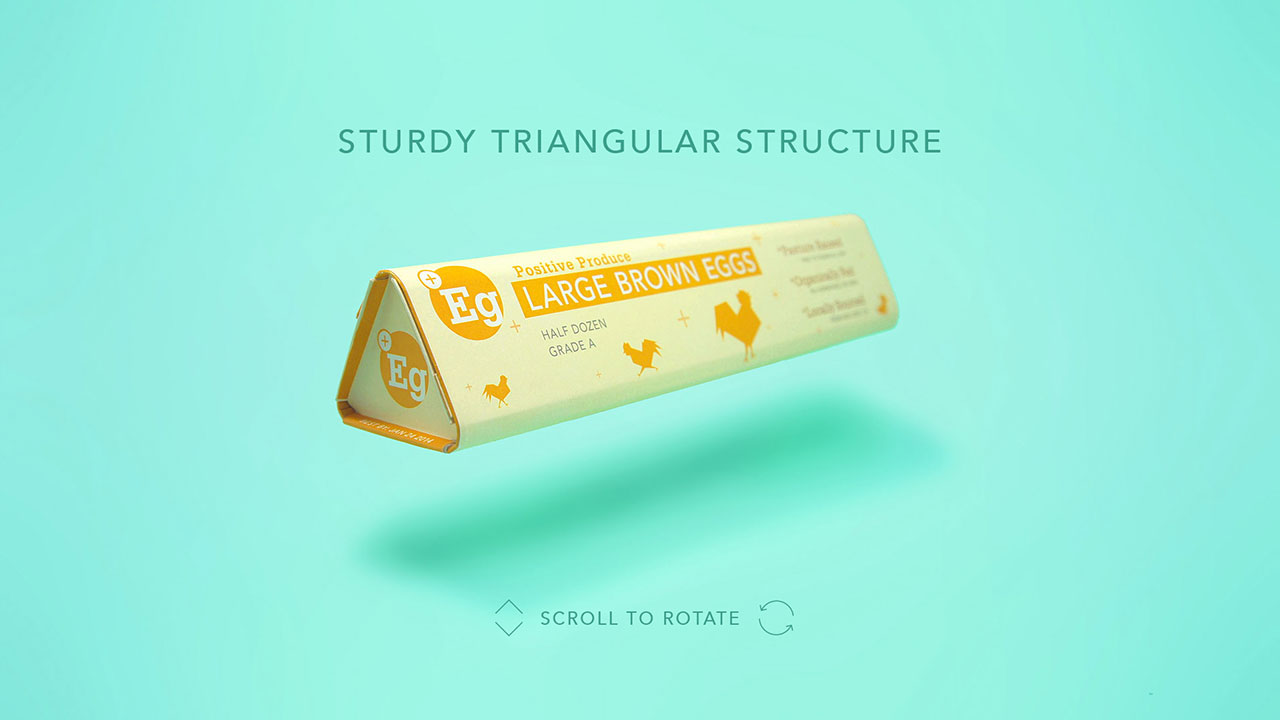
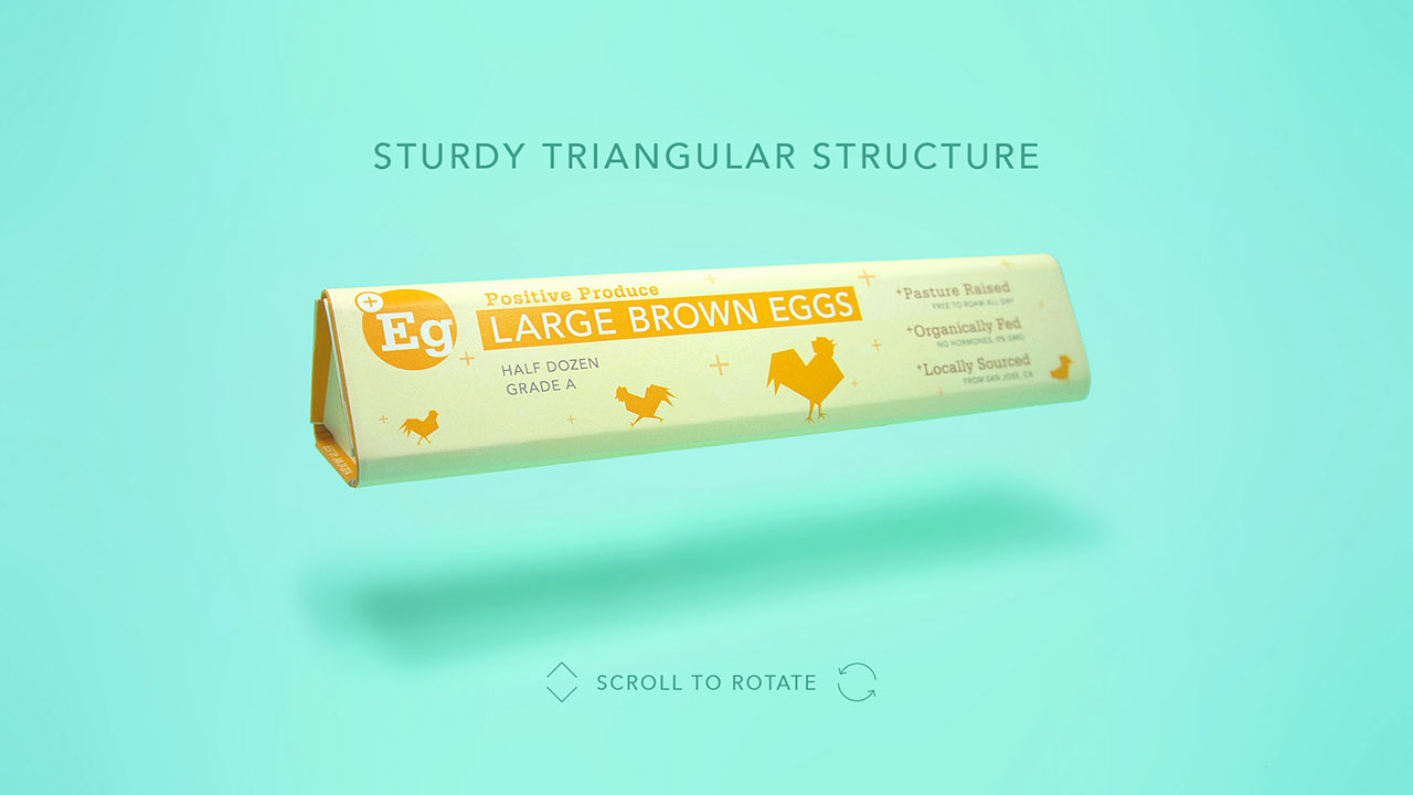
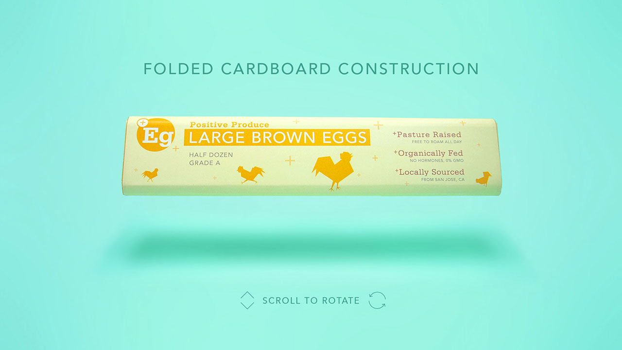
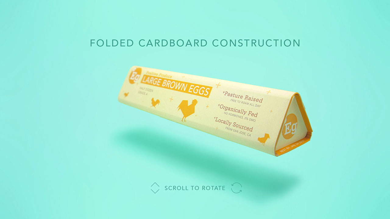
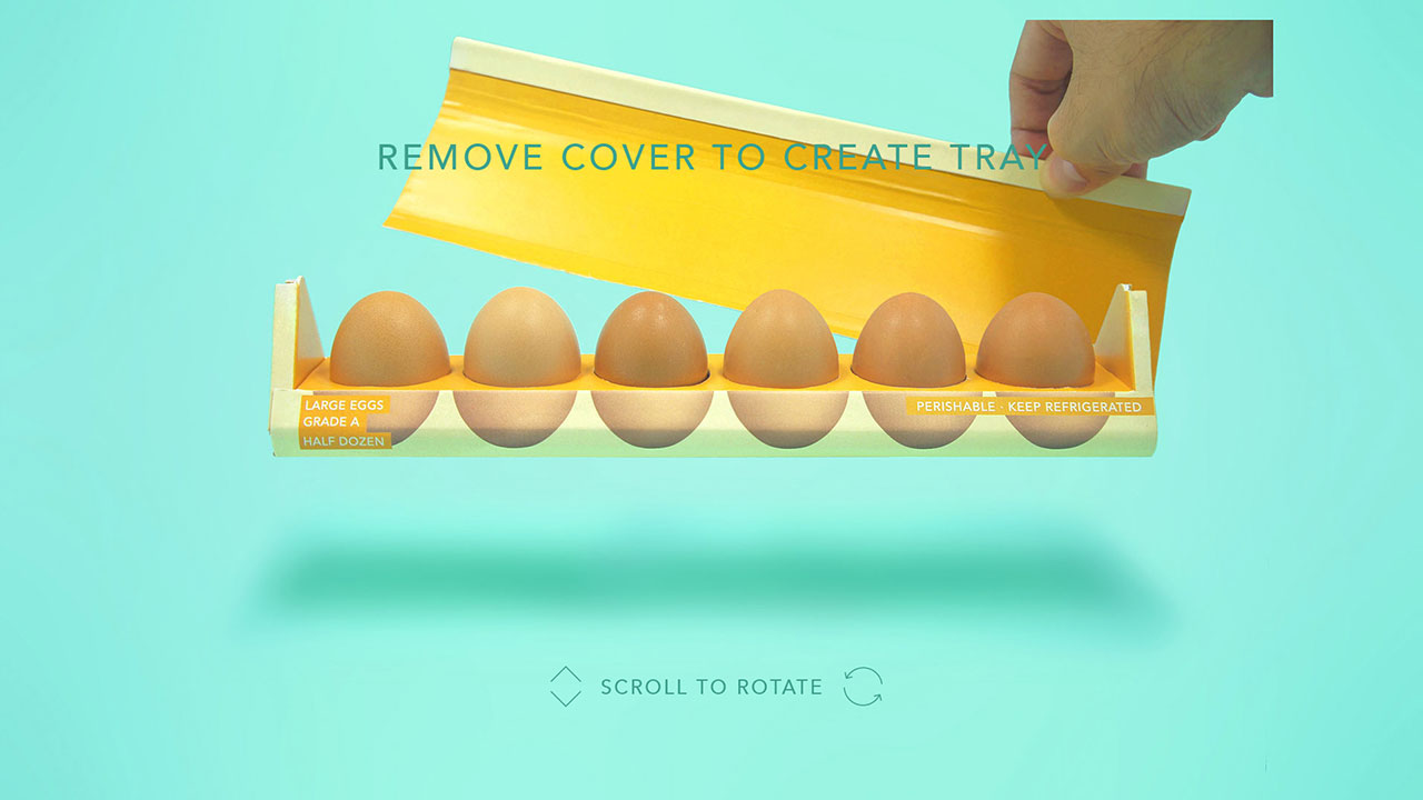
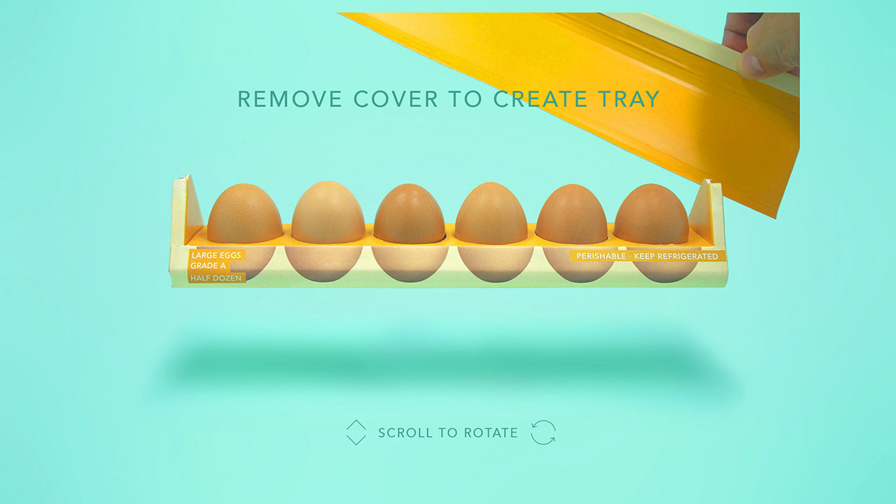
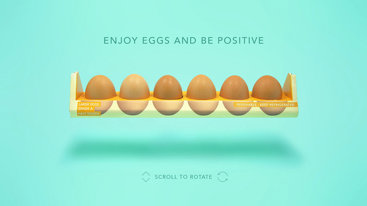
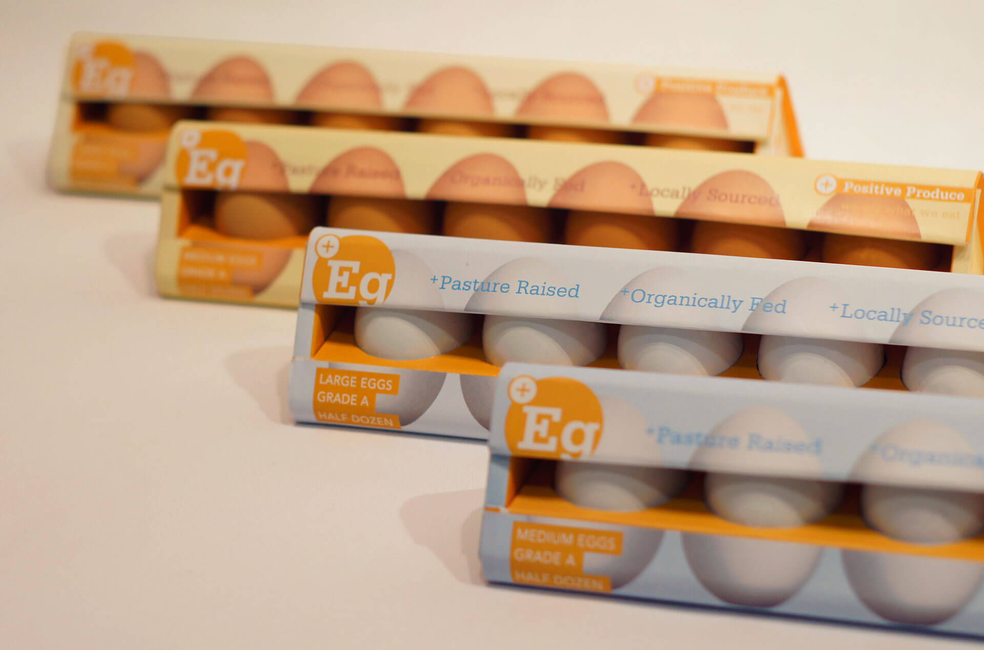
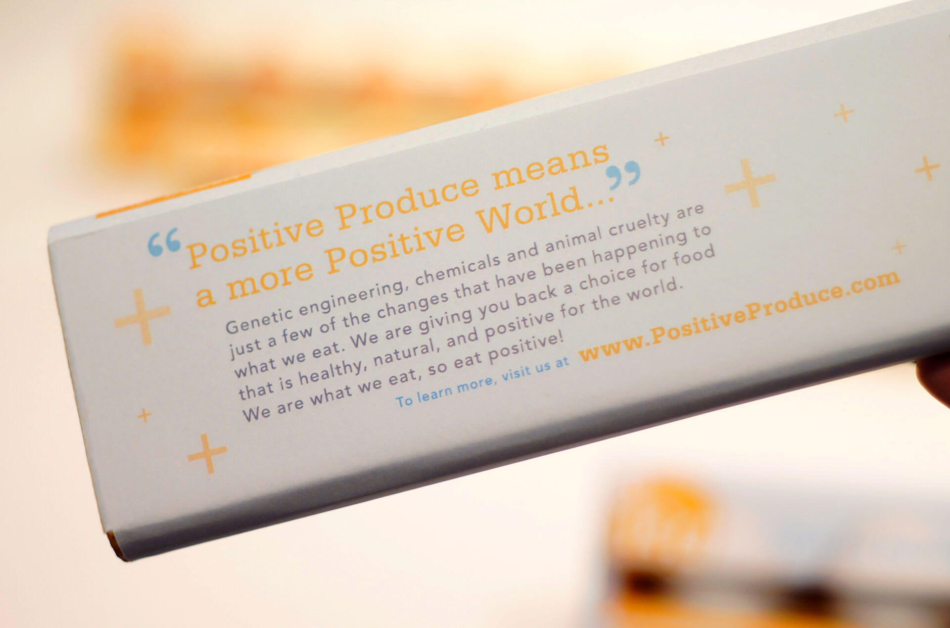
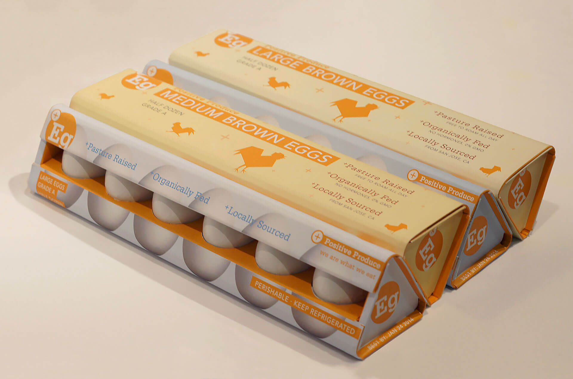
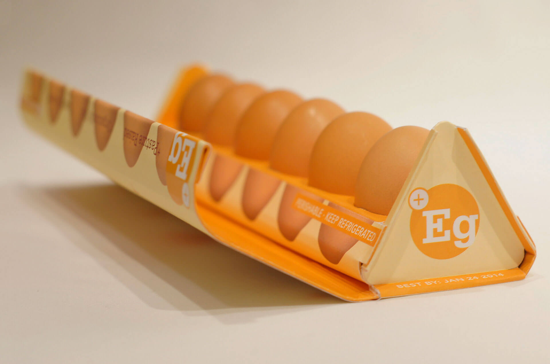
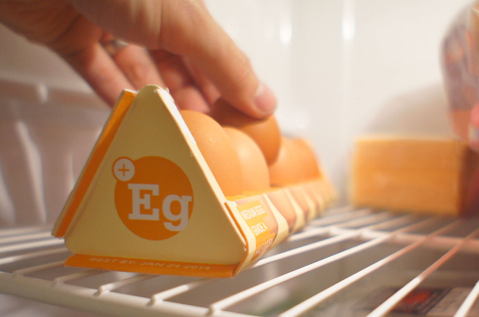
The mass production of eggs has lead to the cruel widespread confinement of hens to small cages for their entire natural lives. Our task was to package and brand eggs that have been pasture raised, free to roam everyday, without cages or animal cruelty.

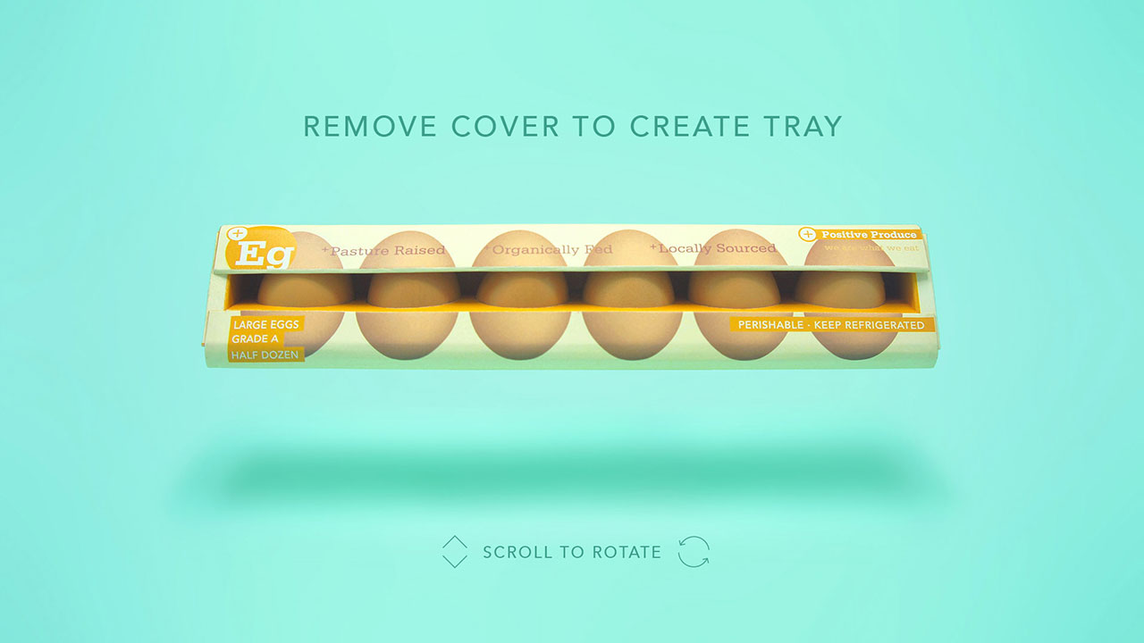
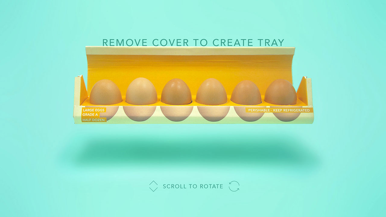
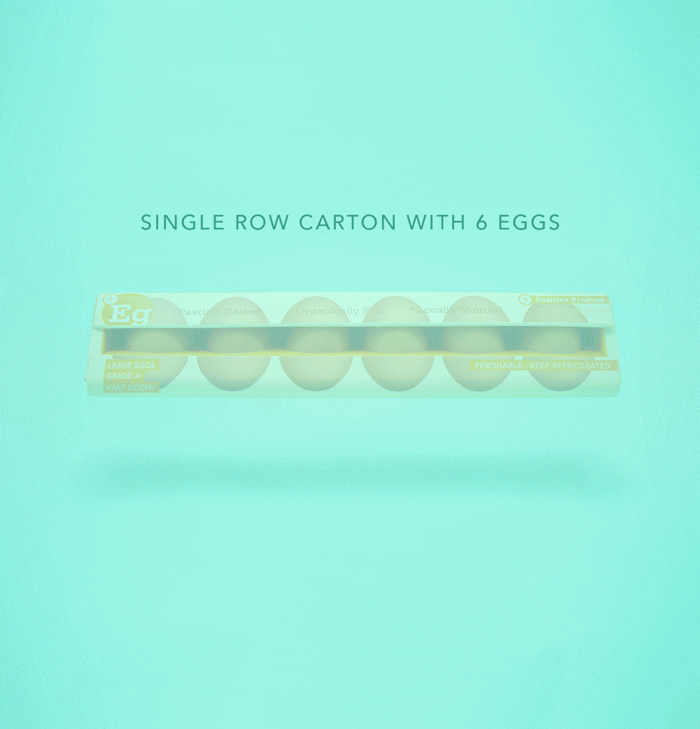
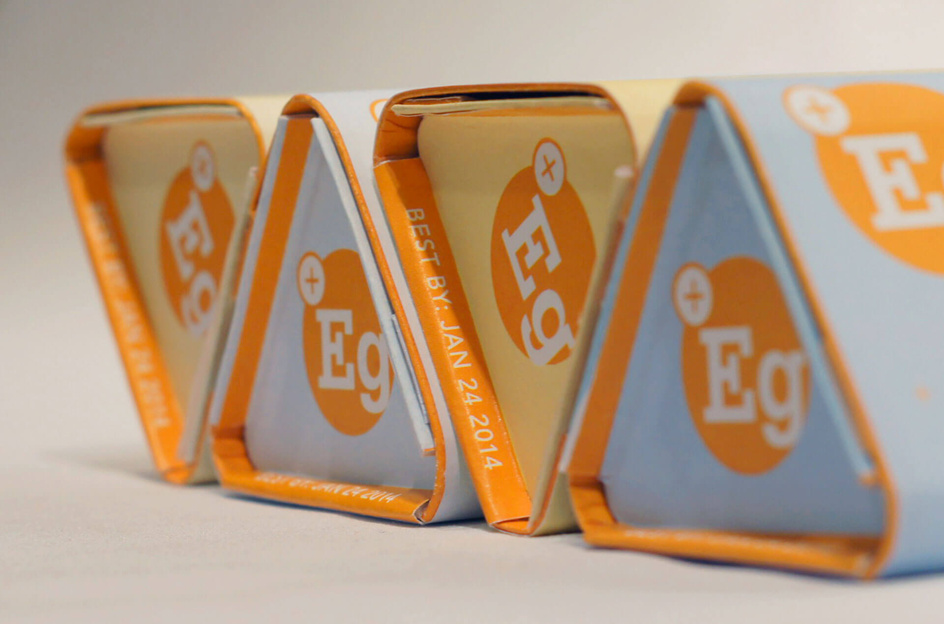
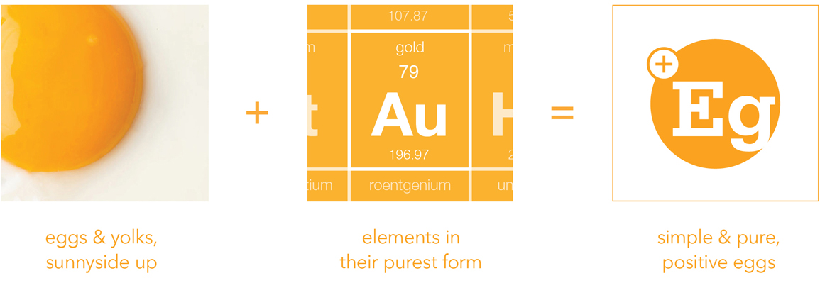
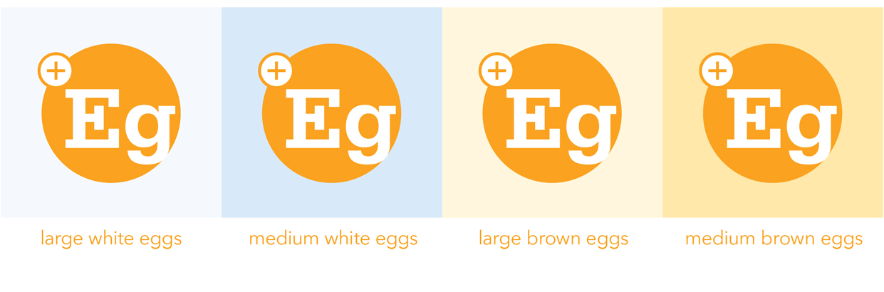
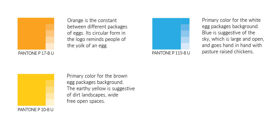
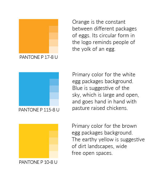
There is a fundamental shift happening in the minds of everyday consumers, where the way a product is made is an important part of the value it offers. It was important that the packaging for postive produce eggs stands apart from the typical egg cartons seen in supermarkets, while still being protective to the eggs and 100% recyclable after disposal.

industry

Food and Agriculture,
Organic Farming

skill sets

Branding, Packaging,
Visual Design

package design


The packaging is designed to create an impression of an entirely new, clean and refreshing approach towards egg production. The simple geometric form and colors stand apart from standard egg cartons. Simplistic graphic elements clearly reflect the elemental philosophy of positive produce.

Unique design features include triangular stackable cartons, more space efficient than traditional egg cartons. The tear off cover creates an egg tray you can slide into your fridge and access. Placement of the best-by date on outer edge is easily visible when looking into your fridge. Color is used to identify different types of eggs, creating a system that works cohesively to identify the brand.

Package Variations

Company Mission (Bottom Side)

Side View, Expiration date

Stackable Cartons

Removable Lid

Open Tray in Fridge

branding


Logo Philosophy


The logo is intentionally simple in form, with a circular orange shape suggestive of an egg’s yolk. The removal of a ‘g’ suggests a simpler egg, its similarity to periodic table typography communicates an elemental and scientific approach to creating a better egg. This idea is reinforced by the positive sign, that literally translates the logo to say ‘positive egg’.

Logo Variations


process


This packaging project was created with the understanding that our target audience want to be ethical consumers, so it is important that the packaging is also environmentally sustainable. The packaging is cut from a single sheet of 11x17 inch recycled card stock paper, which is folded and glued together and printed with soy ink. By using a widely available standard paper size, we reduce production wastage and cost while creating a product that is 100% recyclable.

Package template

Color Palatte

Typography